The Walrus
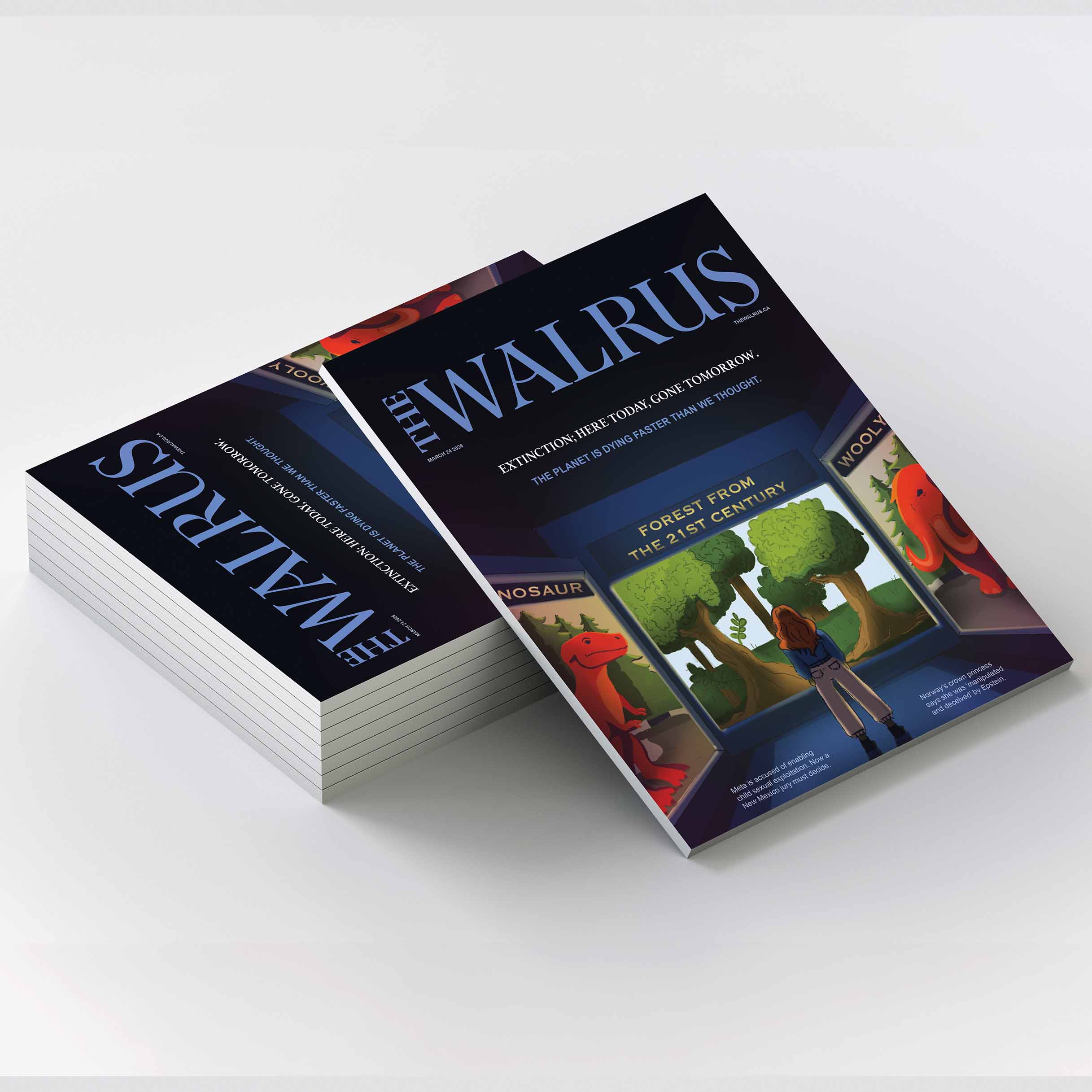
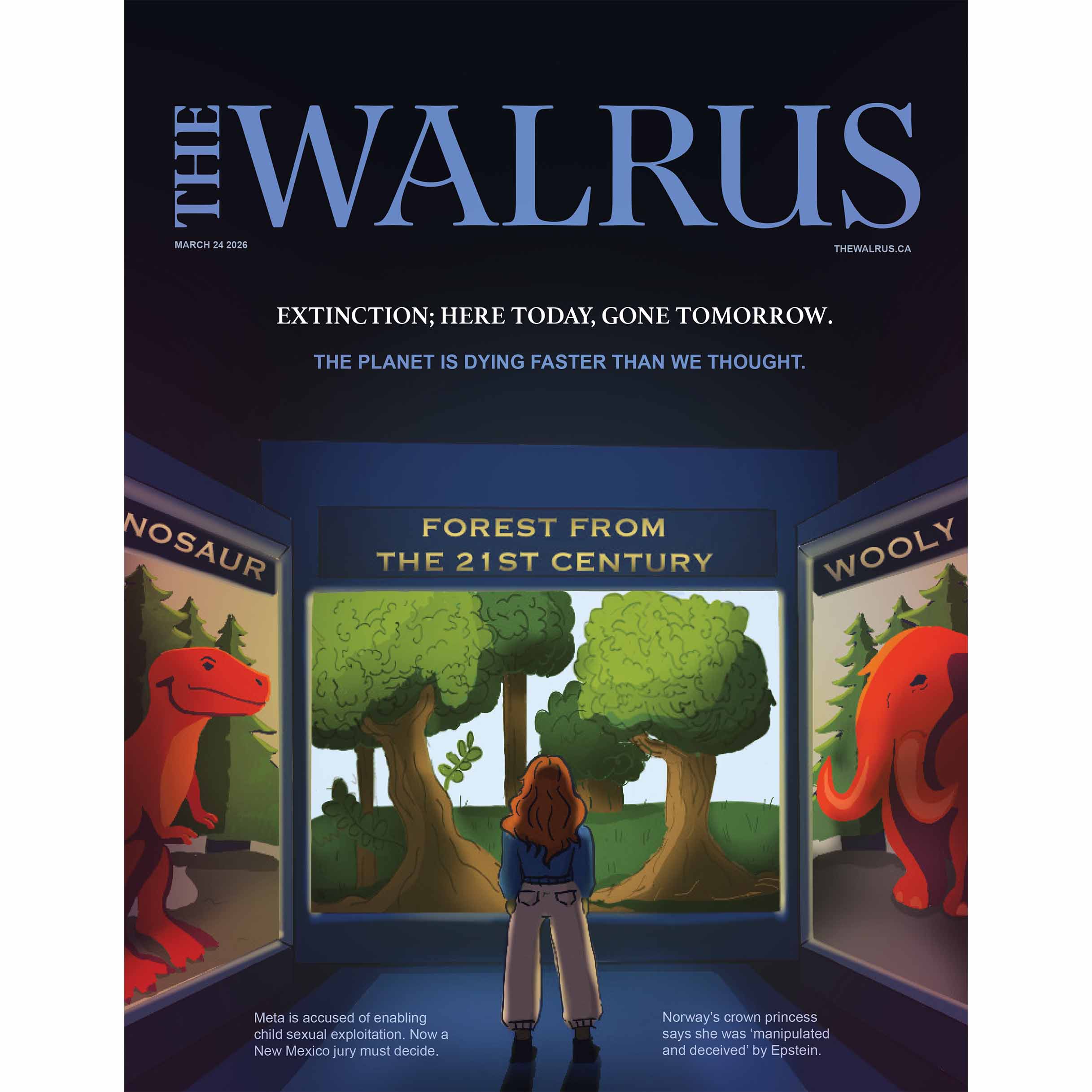
For this project, I designed a magazine cover that balances strong visual impact with clear editorial hierarchy. I used a refined colour palette, bold typography, and intentional composition to draw attention to the feature story while maintaining a cohesive layout. The design emphasizes readability and structure through careful alignment, scale, and spacing. This project highlights my ability to apply editorial design principles while creating a polished and engaging cover.